Header

Showing posts with label webi tips and tricks. Show all posts

Saturday, 21 September 2013

Webi : Showing two values in one cell , but in new line


In Web Intelligence to show values from two different object on to a single column you can use char(10) . ascii value of Char(10) is a new line character.

Example :-  there are two column Prodcut_Id(P0001) and Product_Name(CAR) to be merge into one.
you can create formula : MergedColumn =Prodcut_Id+Char(10)+Product_Name 
that will display result something like this in a single table cell-

 MergedColumn
 P0001
 CAR

WebI Dynamic Measure Selection


As we know, Web Intelligence is a very flexible reporting tool with advanced analytic functionalities. In this post, I’ll demonstrate how to implement a dynamic measures selection solution with Webi. Before we start, let me explain what “dynamic measures selection” is: for example, we have measures including sales quantity, sales revenue, discount amount, target sales revenue, etc. Users want to select which measures to be displayed on the report dynamically. The business background of this requirement is that for each measure, there’re actually multiple measures like this year value, last year value, variance, growth rate, etc. So displaying all measures at once may result in a too large report. So users want to just focus on some of the measures they are interested in.

Given the powerful interactive viewer of Webi, users can drag in measures they need and format the report layout, of course. But what we need is an “interactive report” solution targeted at casual users with little IT skills, rather than power user/data analyst. So we need to create a formatted report with only very simple interactive interfaces: click the check box to select measures you want. Below is the sample report, users select measures on the left panel and measures get displayed/hidden on the right side report area:
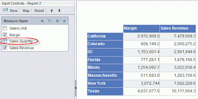


I use following techniques to accomplish this solution:
1. Webi cross table. 
2. Webi Input Control (this is available since XI 3.1 SP2).
3. Universe derived table.

Follow below steps to create above sample report:-

1.      Build simple Universe based on eFasion connection. Add a derived table named “measure_names” with below SQL statement:

select distinct 'Sales Revenue' as mname from outlet_lookup
union
select distinct 'Sales Quantity' from outlet_lookup
union
select distinct 'Margin' from outlet_lookup

2.      Create a dimension object based on the only field of above derived table. The Universe structure is shown in below figure:


3 .Create a Webi query based on this Universe, with objects: State, Measure Name, Margin, Sales Revenue and Sales Quantity. Note that in the Universe, the derived table is not joined with any other table, a Cartesian product will be resulted by this query, and this is what we want.

4.      After the query run, we get the default report as below: -


5.      Create a report variable named “Measure Value” with below definition:
=If([Measure Name]="Margin") Then [Margin] ElseIf([Measure Name]="Sales Quantity") Then [Sales Quantity] Else [Sales Revenue]

6.      Create a Cross Table, put State object on the row, Measure Name object on the column, and Measure Value variable on cell.

7.      Create an Input Control based on the Measure Name object. Choose check boxes as the control type.

WebI Bars embedded into table rows


This article here described a tricks to create some  visual representations for WebI displays that effectively extend WebI's visualization options and simultaneously provide end-user interactivity. The Idea here is to horizontal bars to vertical table.


Yes, this is an actual WebI table with bars in the cells that proportionally display the sales revenue values for each row. through bars, you can quickly assess both ranking and variation among the sales revenue values. also at the same time, you can display other details in the same rows as the bars. In the table above, I’ve got a calculation to determine the % change in Sales Revenue quarter on quarter. You can also see in the same row the Quantity sold. Charts are great at displaying messages around a theme, such as ranking and distribution. Tables can display lots of details. Bar charts in tables give the benefits of both. 

This really was simple. It took 4 easy-to-define variables and its 4 steps process as mentioned below
Note :- That the variables below can be combined into a big formula, but it's just easier to manage and conceptualize is that you break it down into components.

  1. You'll need to define the generic filler that is used to draw the "bars". Create a variable named "Chart filler". Qualify it as a Detail in the variable editor, and in the formula text add 100 characters between quotes. You can choose the filler you want to use -- whether "]" or "|" or another symbol. (I know you know this but to populate 100 characters please don't hit the return key 100 times, type 10 characters, then copy-paste 9 times   ="]]]]]]]]]]]]]]]]]]]]]]]]]]]]]]]]]]]]]]]]]]]]]]]]]]]]]]]]]]]]]]]]]]]]]]]]]]]]]]]]]]]]]]]]]]]]]]]]]]]]"
  2. Then create a variable that calculates the maximum value in the table. This will be used to define the maximum length for a bar in the column, against which the other values will be proportionally displayed. Qualify it as a measure and call it "Max Sales rev from block" and use the following formula: =(Max([Sales revenue]) In Block)
  3. Now calculate the size of the bar for a given value based on the relative proportion to the maximum value in the table. Name the variable "Sales Revenue Bars: Calc Size of Bar" and qualify as a measure.
    =Round((([Sales revenue]/[Max Sales rev from block])*100);0)
    This is simply sizing a row's value in proportion to the maximum value in the row. For example, if the maximum value is 100, and the actual value being evaluated is 75, this formula will output “75”.
  4. Finally, define the variable you'll use in the actual table to draw the bars. The Substr function simply removes the characters in the [Chart filler] string you defined to show the proportional size of the bar. Call this variable “Sales Revenue Bars” and qualify as a measure.
    =Substr([Chart filler];1;[Sales Revenue Bars: Calc Size of Bar])Drop the "Sales Revenue Bars" measure into a table. It's now super easy to scan down a column to identify not only the largest values, but also the variability among the values.